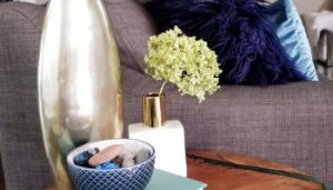
My coffee corner makeover is finally done! (Cue angelic choir singing.)
Before this transformation, I would start my day by puttering over to a boring (yet functional)”brew station” for my morning caffeine compulsion. As I mentioned in my previous post, this corner of the kitchen didn’t get any decorative trimmings and attention – it was all biz-ness. (That’s how cool kids say business)
If you missed my last post, here’s the really sad and embarrassing before picture.

But now…..UH…(hands clutched over heart)- I love it! This small corner of the world helps me start my day off with a smile. It is both pretty AND practical; and like anyone who’s undertaken a makeover knows, I regret not getting it done sooner.
Because our home is open concept, I had to be sure that the colour scheme and decor would be cohesive with the rest of the house. However, I didn’t have to be all matchy matchy because this corner is sort of tucked away next to the fridge.
After 2 broken espresso cups, a few extra holes in the wall, some swearing (anyone put up vinyl wallpaper before??) and multiple trips to HomeSense, Bowring and Ikea…here it is. What do you think?


The original transformation started with inspiration from a piece of modern colourful floral artwork (think shades of tangerine, peach,golden and lemon yellow) set in a simple white and navy blue vase. Since our family room is navy, teal, gold and white, I thought this would compliment the colour scheme while avoiding the matchy matchy affliction (and I could inject some spring colour).
Turns out, once the art was hung….(and the shelf redecorated) the space didn’t feel right. I couldn’t put my finger on what the issue was – all I knew was that I wasn’t 100% in love with it.
As it happens so many times, I think and I think and I think (and fiddle and rearrange) then one night..just as I’m about to fall asleep – it hits me – BALANCE!… the space wasn’t balanced, which is why it didn’t feel right. Even though the artwork was large (I mean really big) it still didn’t balance out all the heavy black and chrome coffee contraptions sitting on the countertop.
As soon as I made the decision to add another shelf, the rest of the design became easier. A visit to Target on Saturday saw me pick up gold chevron print, vinyl removable wallpaper. This last minute addition to the design as a backdrop really punched up the glam factor on this makeover. Plus, I think this wallpaper will work well throughout the seasons and is neutral enough to work with multiple colour palettes. (Sidenote: When my husband saw it on the wall, he told me it was “different” – that’s usually code for “I’m not sure about this but I will trust you and see what happens”. After it was done, he said he really liked it and said ” the gold wallpaper is not so “BAM IN YOUR FACE!”
I’ll take that as a win. 😉


